D’AGE
D’AGE
D’AGE is a premium clinic offering integrated care in skin, dental, and hair treatments. With a focus on precision, innovation, and patient-first care, D’AGE enhances natural beauty while ensuring medical excellence.

Crafting Ageless Confidence
The Problem client was facing
Two doctor couples launched D’AGE to offer premium anti-ageing skin & dental care. But in suburban Perumbavoor, their first venture needed more than visibility; it needed a distinct luxury identity.
Where Medical Excellence Meets Natural Beauty
The Solution
From curating a refined color palette & crafting a timeless brand identity to executing creative strategies & digital experiences that resonated with the right clientele, we brought their dream to life, seamlessly blending local presence with premium perception. The result? A brand that looks as sophisticated as the science behind it
Skin, Smile, and Hair, Perfected Under One Roof
Where it Began
Two doctor couples set out to launch D’AGE, a premium clinic for skin, hair, and dental wellness in suburban Perumbavoor. Their vision was clear: medical excellence with a luxury experience. Our task was to build a brand that made that vision visible and trusted from day one.
Discover
We studied the local market, competitors, and patients to understand how premium care is perceived in a suburban setting.
Define
We positioned D’AGE as an integrated skin, hair, and dental clinic with a confident voice reflecting medical precision.
Design
We designed a logo, palette, and collateral that convey care, renewal, and trust in a refined, premium identity.
Develop & Deliver
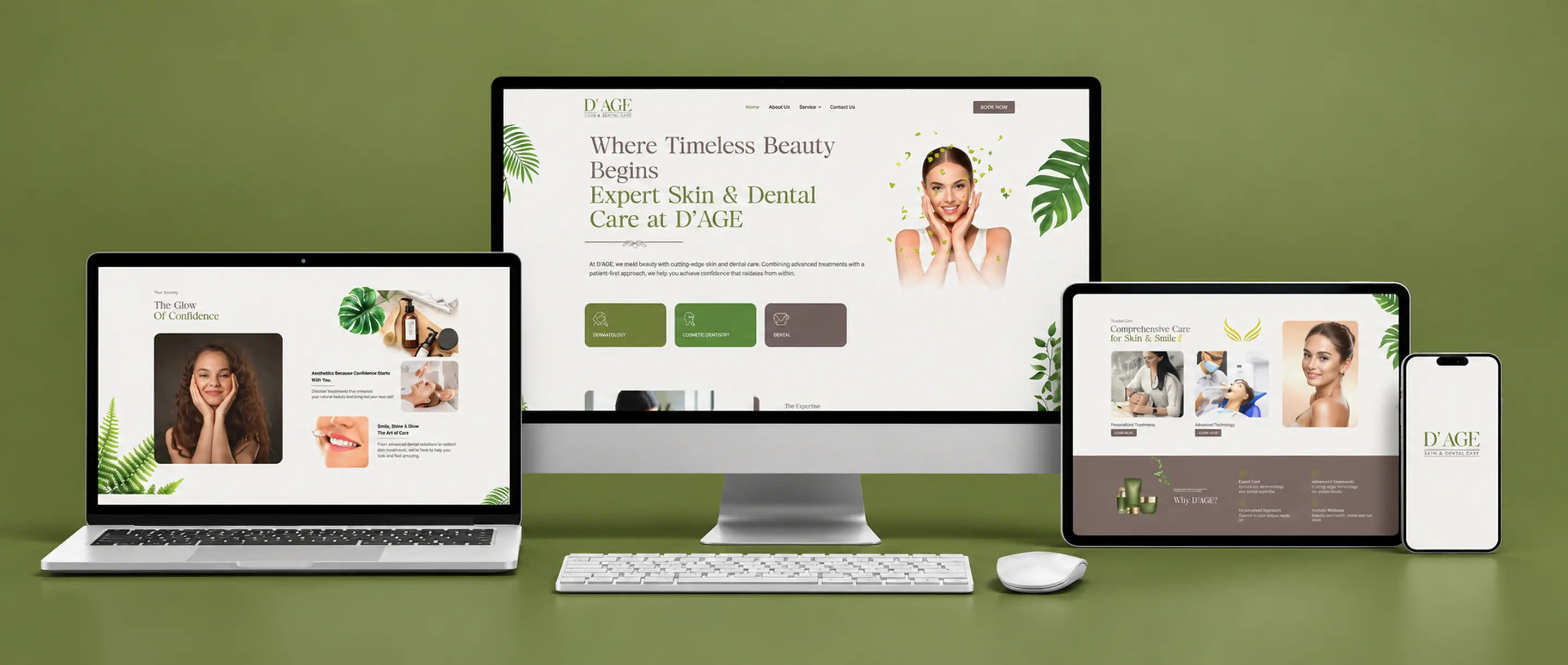
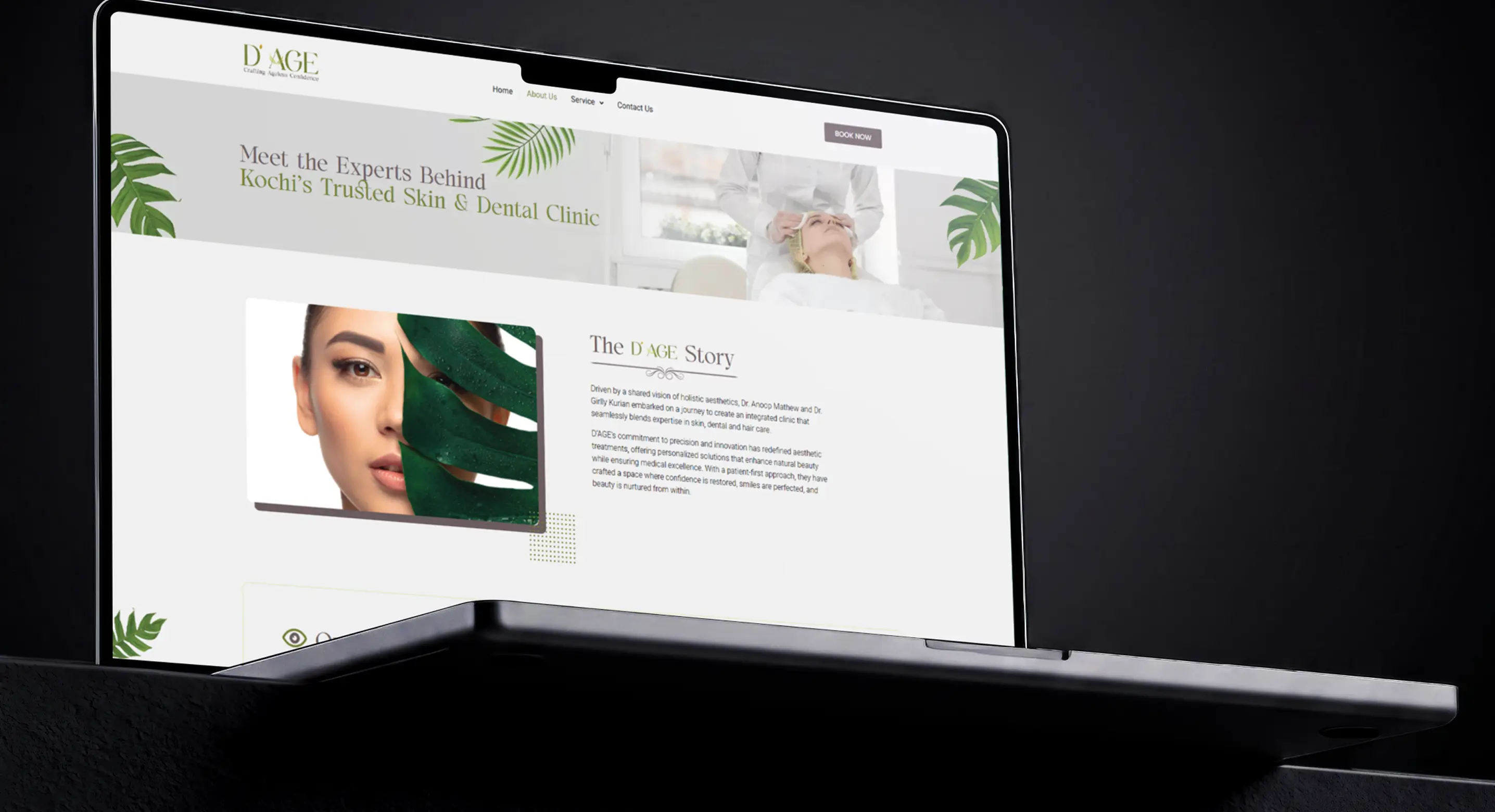
We built a premium website that guides patients from first impression to booking a consultation.
A Visual Language of Confidence
Every element of D’AGE, from its dew-drop mark to its gold tones, is designed to feel fresh, refined, and quietly confident.
D’AGE means Beauty Renewed with Care
By uniting aesthetics, dermatology, and dental care, from glowing skin to confident smiles, D’AGE turns everyday wellness into a refined ritual. The D’AGE concept is inspired by morning dew and caring hands, so every treatment refreshes, reassures, and leaves you visibly renewed.
It’s not just about treating age; it’s about redefining how it looks and feels. Making the Name “D’AGE” – Crafting Ageless Confidence
Identity Pillars



The Dew Effect
Core Identity
Like morning dew, D’AGE renews and refreshes. Its holistic approach to aesthetics, dental care, and dermatology helps every patient look and feel their natural best.
Visual Identity
Inspired by the purity of morning dew, D’AGE’s visual identity pairs a refined, calming palette with clean, timeless design. Every element reflects freshness, renewal, and the precision of medical care.



The Caring Hands
Core Identity
At its heart, the brand stands for care and support, offering comfort, trust, and personalised attention at every step of the patient journey.
Visual Identity
The hands in the logo symbolise care and support, a visual promise that every patient is held with comfort, trust, and personal attention.
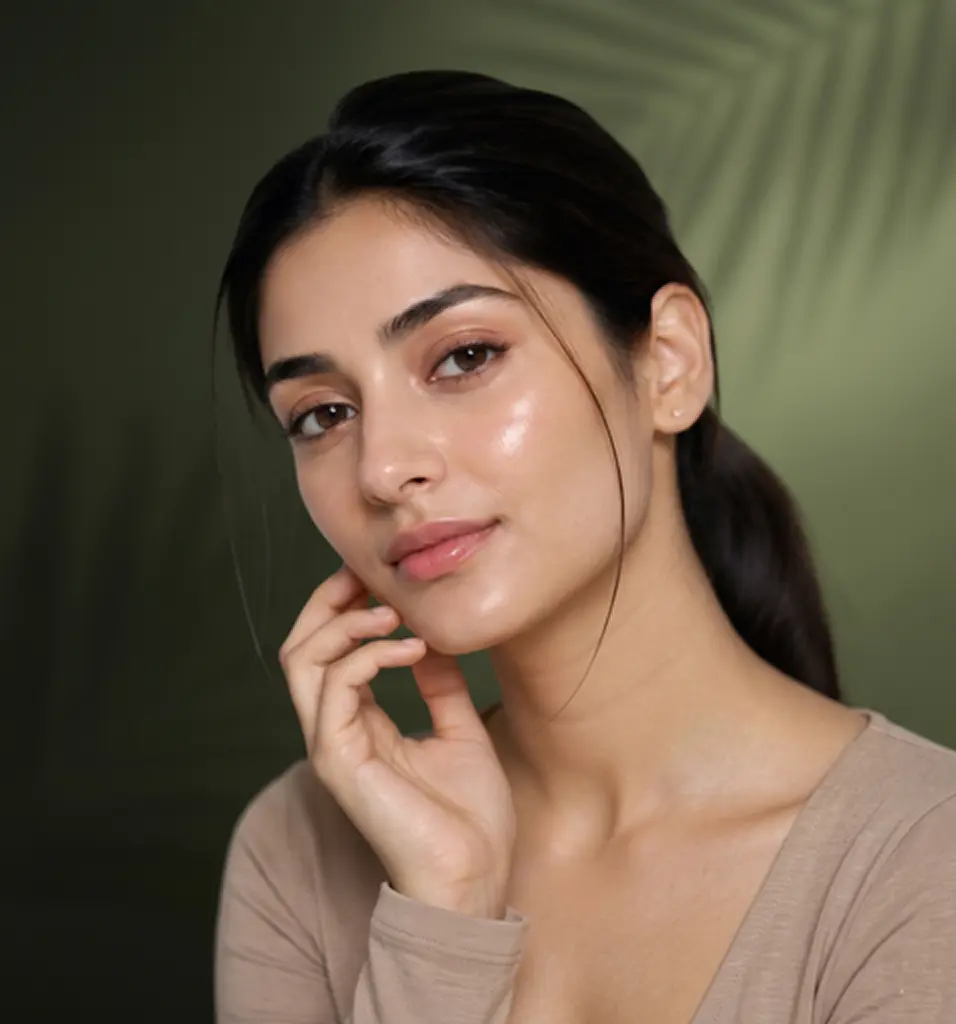


The Age Redefiner
Core Identity
D’AGE delivers tailored skin, dental, and wellness solutions that help you radiate confidence and redefine your facial age.
Visual Identity
Clean lines, soft tones, and a refined finish reflect D’AGE’s promise of renewal, giving the brand a look that feels as confident and youthful as the results it delivers.

#718136
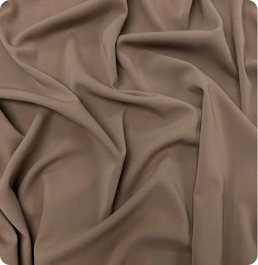
#695b5a

#D7AE5B

Solenoidal - Regular

Podrich-Regular

Roboto-Regular
Business Collateral & Merchandise
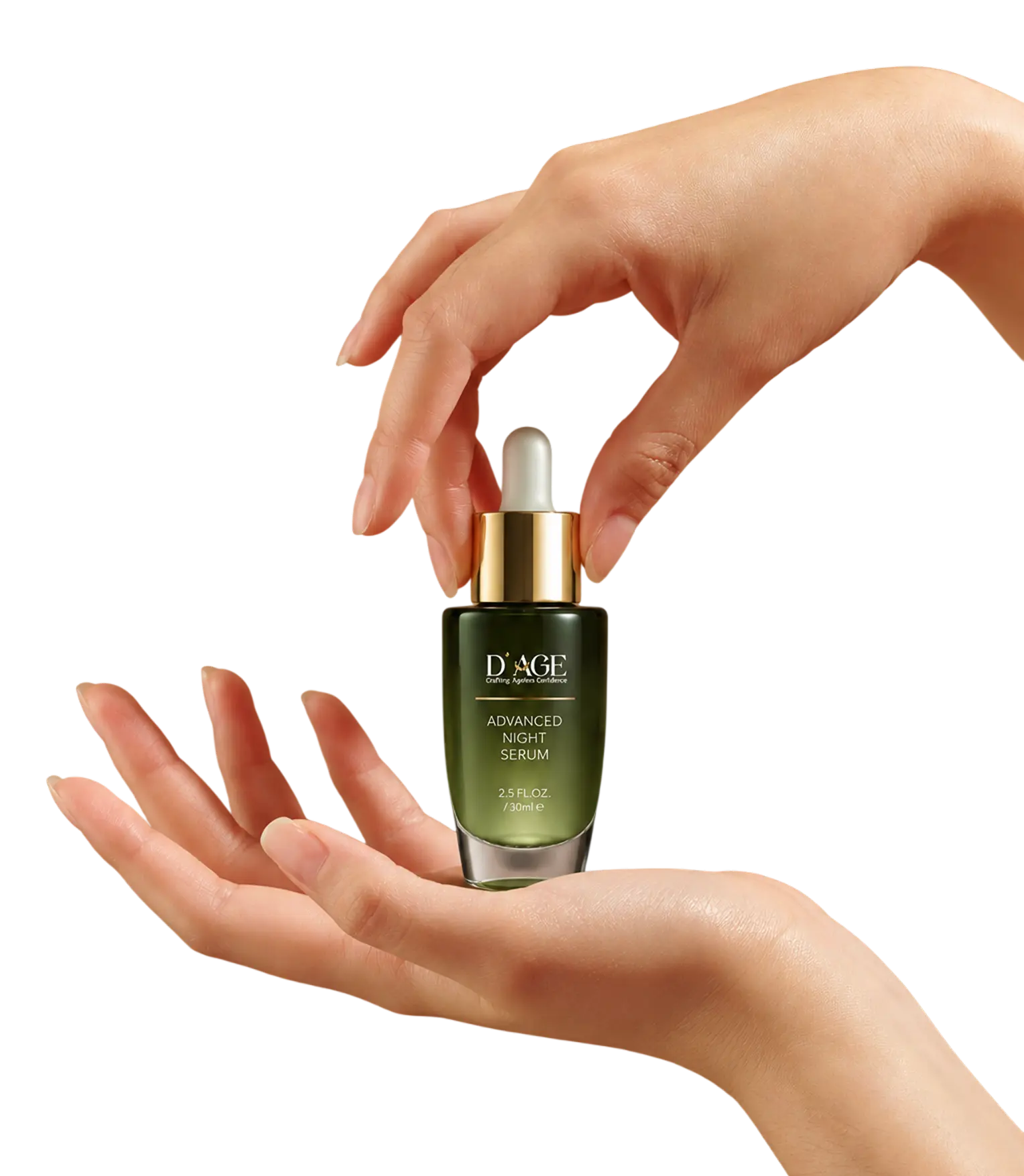
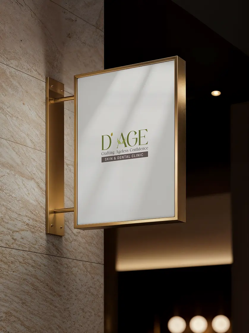
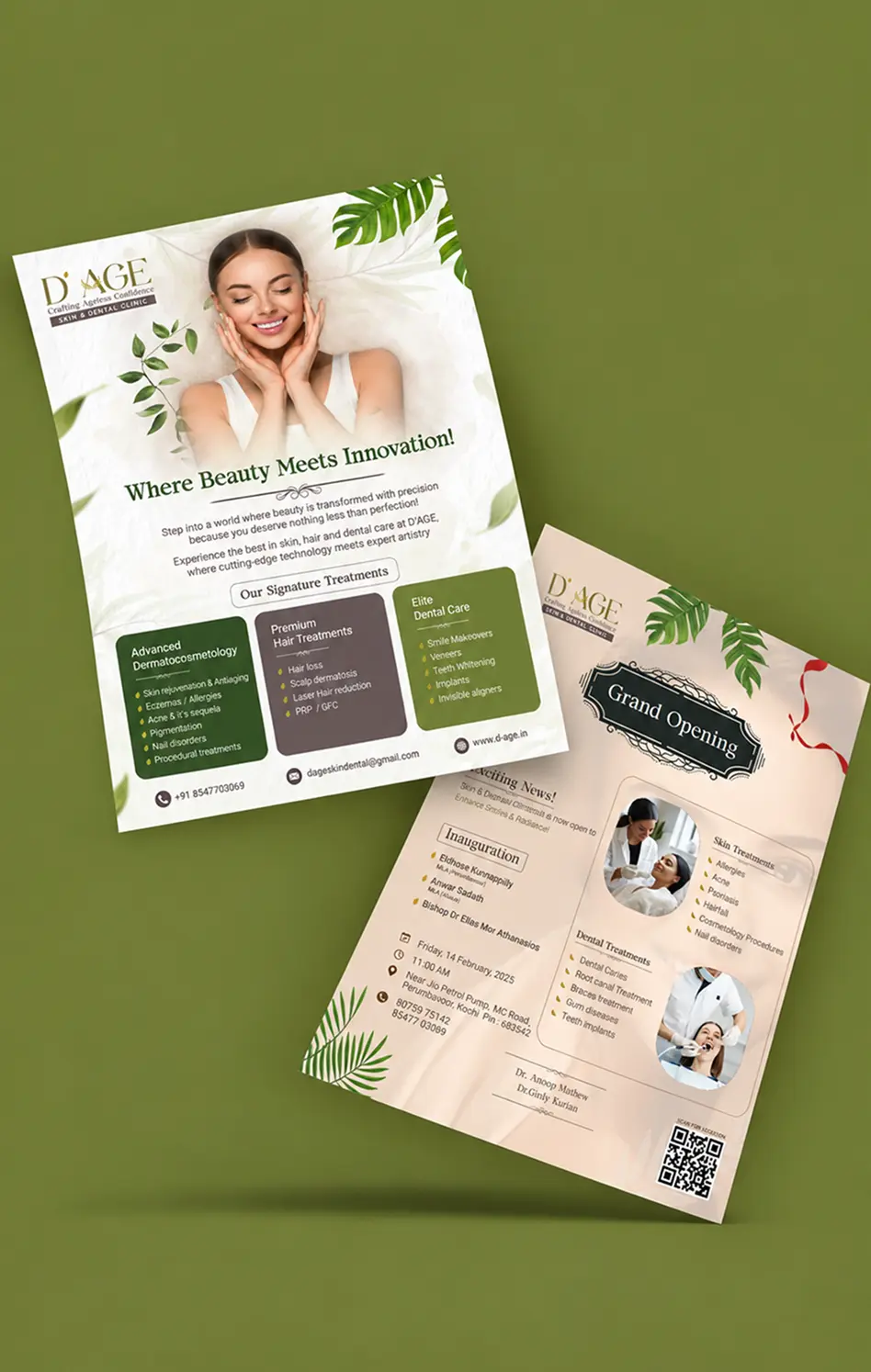
A cohesive system of stationery, merchandise, and outdoor media, built on D’AGE’s earthy greens, warm neutrals, and elegant typography.

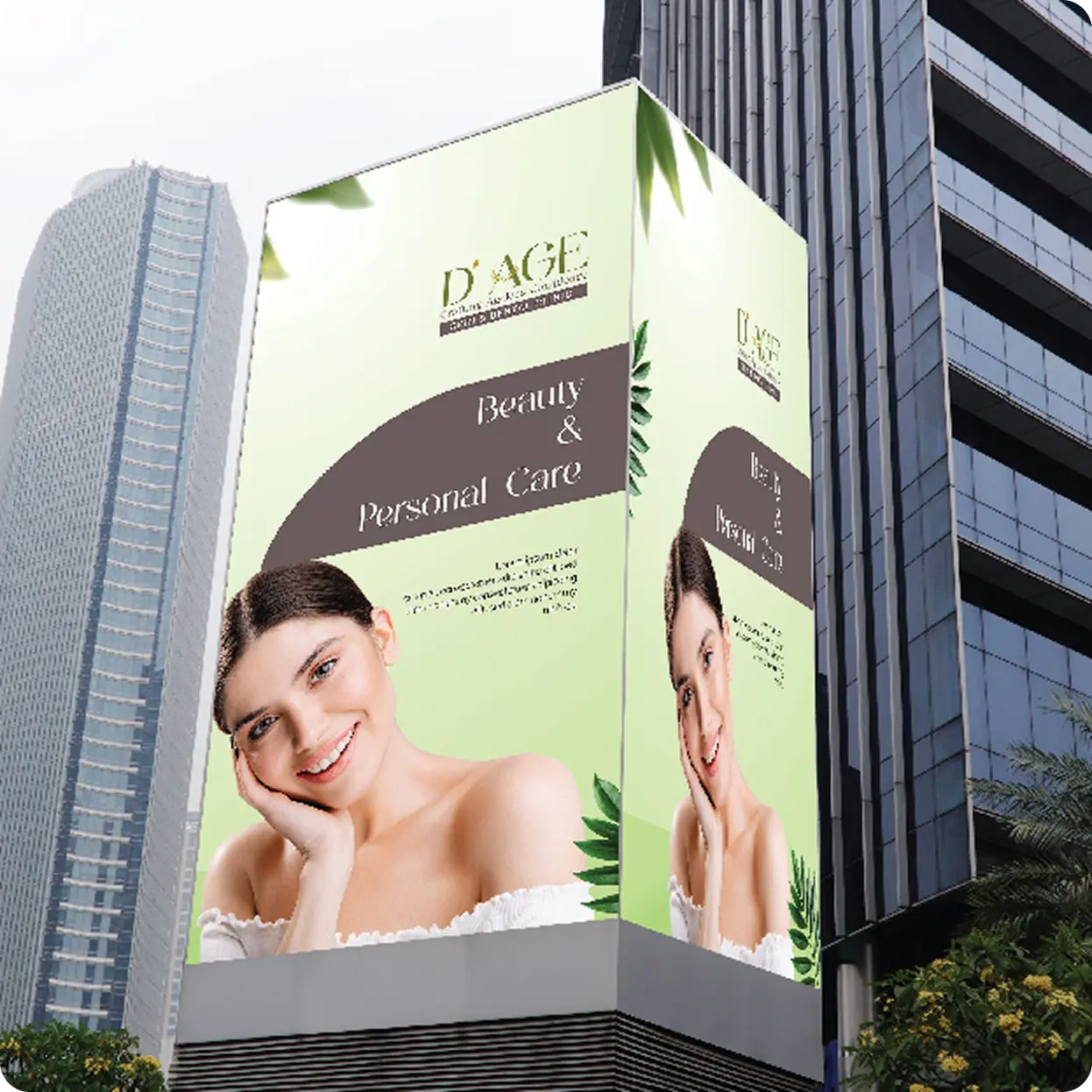
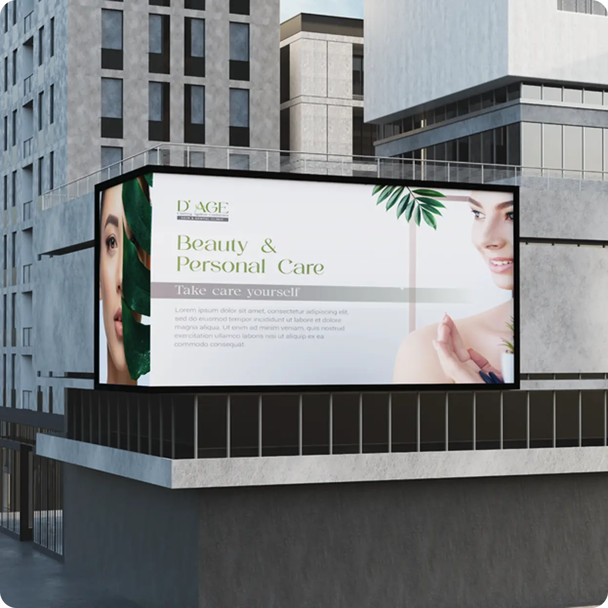


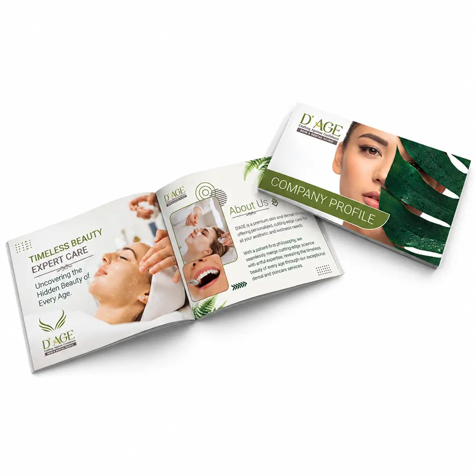
Marketing Collateral
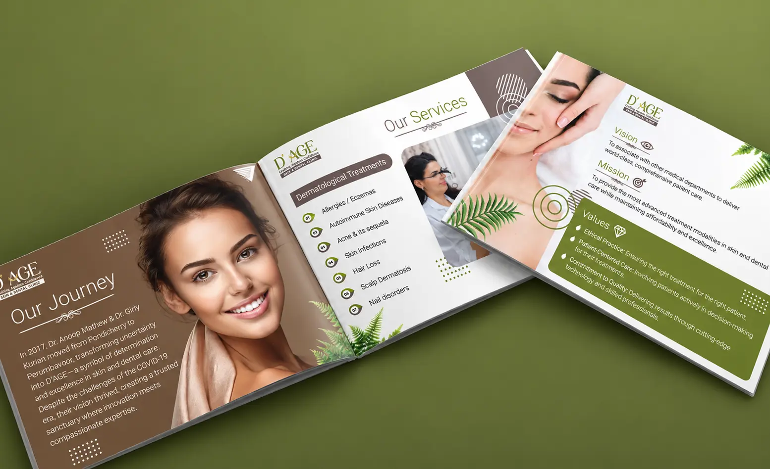
Designed to build trust at first glance, the D’AGE brochure takes clients through the brand’s journey, expertise, and philosophy of care with clarity and warmth.
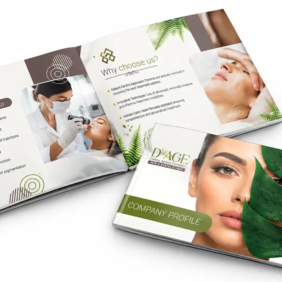
Final Design
The final D’AGE identity brings every element together into one cohesive brand. The dew-drop mark, soft greens, refined gold, and elegant typography work across stationery, signage, brochures, and digital spaces. The result is a brand that feels fresh and premium wherever it appears, reflecting its promise of crafting ageless confidence.
UI/UX Design & Development of D’AGE Website
The UI/UX design was structured to capture the elegance of food as a food lover scrolls through the page, seamlessly combining videos and images, thoughtfully aligned to create an immersive visual experience.