Jieevarra
What is Jieevarra
Jieevarra is a multi-cuisine nutrition platform rooted in Indian food wisdom. It blends health and taste to bring balance to everyday eating, making healthy living conscious, enjoyable, and nourishing.

Jieevarra The Joy of Balanced Nourishment
The Problem client was facing
Fast-paced lifestyles had pushed everyday eating towards convenience, leaving little room for India’s rich food wisdom. In a market where healthy food often felt bland and tasty food felt indulgent, Jieevarra risked being seen as either too much of a diet brand or just another kitchen.
Healthy food felt like a compromise. Jieevarra proved it wasn’t.
The Solution
Ourea positioned Jieevarra as a lifestyle-driven nourishment brand built on joyful, balanced eating. A clean, minimal identity with natural elements makes it feel premium yet accessible, while the storytelling presents food as desirable, not restrictive. The result is one consistent narrative of joyful nourishment across every touchpoint.
Rooted in tradition. Made for modern life.
Where it began
Jieevarra began with a simple belief: healthy food should never feel like a compromise. Rooted in traditional Indian food, its idea was strong, but it needed a brand that made balanced eating feel joyful, and Ourea’s role was to bring that idea to life.
Discover
We studied modern eating habits and the wellness market to understand why healthy food so often felt restrictive.
Define
We positioned Jieevarra as a lifestyle-driven nourishment brand, with a warm, refined voice built on joyful, balanced eating.
Design
We created a clean, minimal identity with natural elements and storytelling that makes healthy food feel desirable.
Develop & Deliver
We brought the brand to life through content, corporate partnerships, and integrated marketing across every touchpoint.
A Visual Language of Nourishment
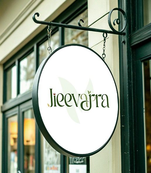
Every element of Jieevarra, from its leaf-led wordmark to its earthy olive greens, is designed to feel natural, nourishing, and joyfully balanced.
Jieevarra The Joy of Balanced Nourishment
By blending authentic Indian food wisdom with modern lifestyles, from conscious nourishment to joyful eating, Jieevarra brings balance to everyday food without losing its joy. The leaf growing from the wordmark reflects life and vitality at the heart of every meal, a reminder that healthy eating can be both nourishing and enjoyable.
It’s not just about eating healthy; It's about bringing balance to everyday life. Making the Name “Jieevarra” - The Joy of Balanced Nourishment
Identity Pillars
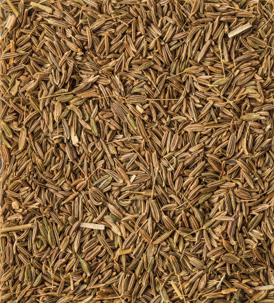


J = Jeera
Core Identity
Cumin represents warmth, balance, and everyday nourishment. Rooted in Indian food wisdom, it reflects Jieevarra’s belief that healthy eating should feel flavourful and familiar.
Visual Identity
Warm browns and muted golds create an earthy, grounded look. The seed’s fine, organic form brings authenticity, tradition, and natural richness to the brand.
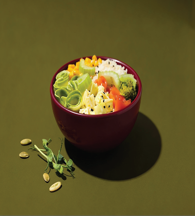


i = Food Bowl
Core Identity
The bowl reflects Jieevarra’s purpose of bringing diverse cuisines, wholesome ingredients, and mindful portions together in one fulfilling experience.
Visual Identity
Its rounded form conveys comfort, abundance, and care, while the fresh ingredients express variety and a multi-cuisine approach to balanced nutrition.



ar = Infinity
Core Identity
The infinity loop stands for continuous nourishment, reflecting Jieevarra’s belief that healthy eating is a lifelong practice built on mindful choices.
Visual Identity
Its seamless, flowing curves express harmony and sustainability, making health, taste, and authenticity part of everyday living.



Leaf
Core Identity
The leaf represents natural nourishment and mindful living, reflecting Jieevarra’s commitment to food rooted in wellness, purity, and vitality.
Visual Identity
Its soft, organic curves bring freshness and natural balance, connecting the brand to wholesome nutrition and conscious living.
#38421b
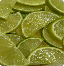
#86885a
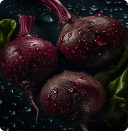
#3a0008

Gradient

Libel - Regular

Storytelling _Regular
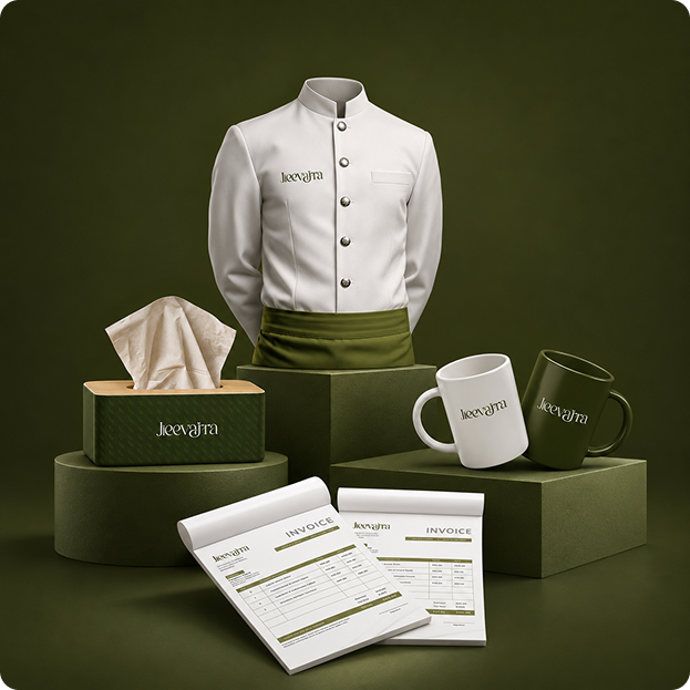
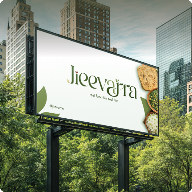
Business Collateral & Merchandise
Every Jieevarra brand piece carries earthy olive greens and natural warmth, a quiet signature of joyful, balanced nourishment in every form.
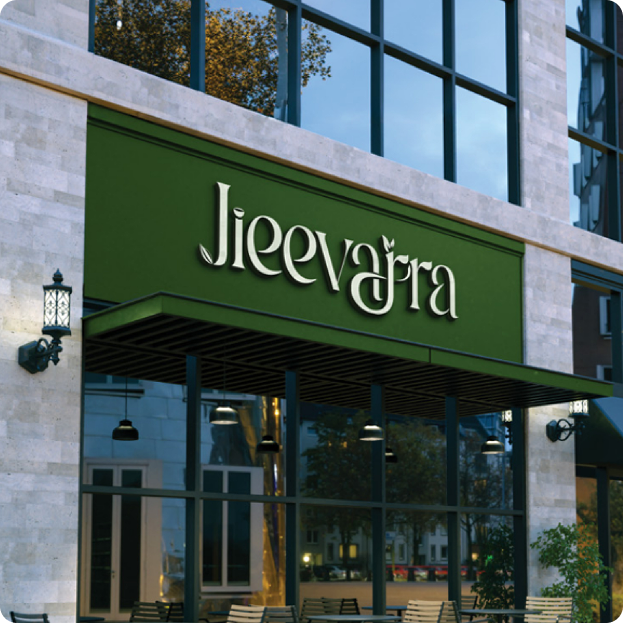
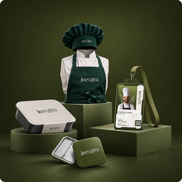
Marketing Collateral
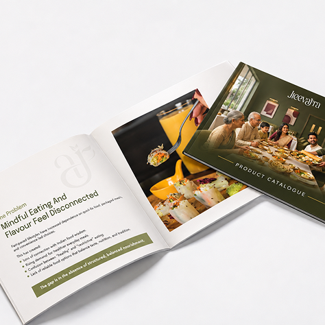
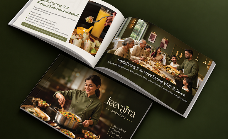
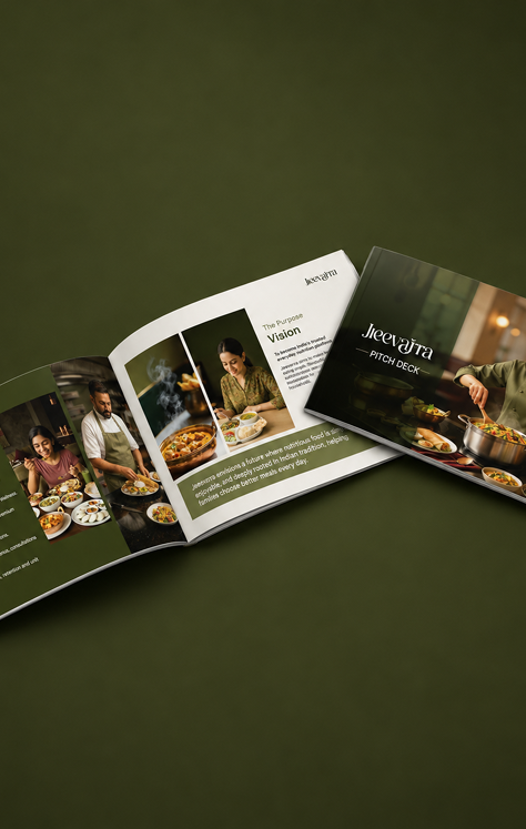
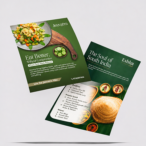
From menu cards and brochures to flyers, Jieevarra’s collateral pairs earthy greens with clean layouts and fresh food imagery, presenting the brand’s concept simply and clearly.
Final Design
The final designs bring Jieevarra’s identity together across print, with earthy greens, clean layouts, and fresh food imagery that keep the information clear and easy to read. Hence, the brand feels familiar wherever it appears.
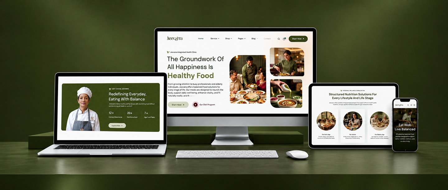
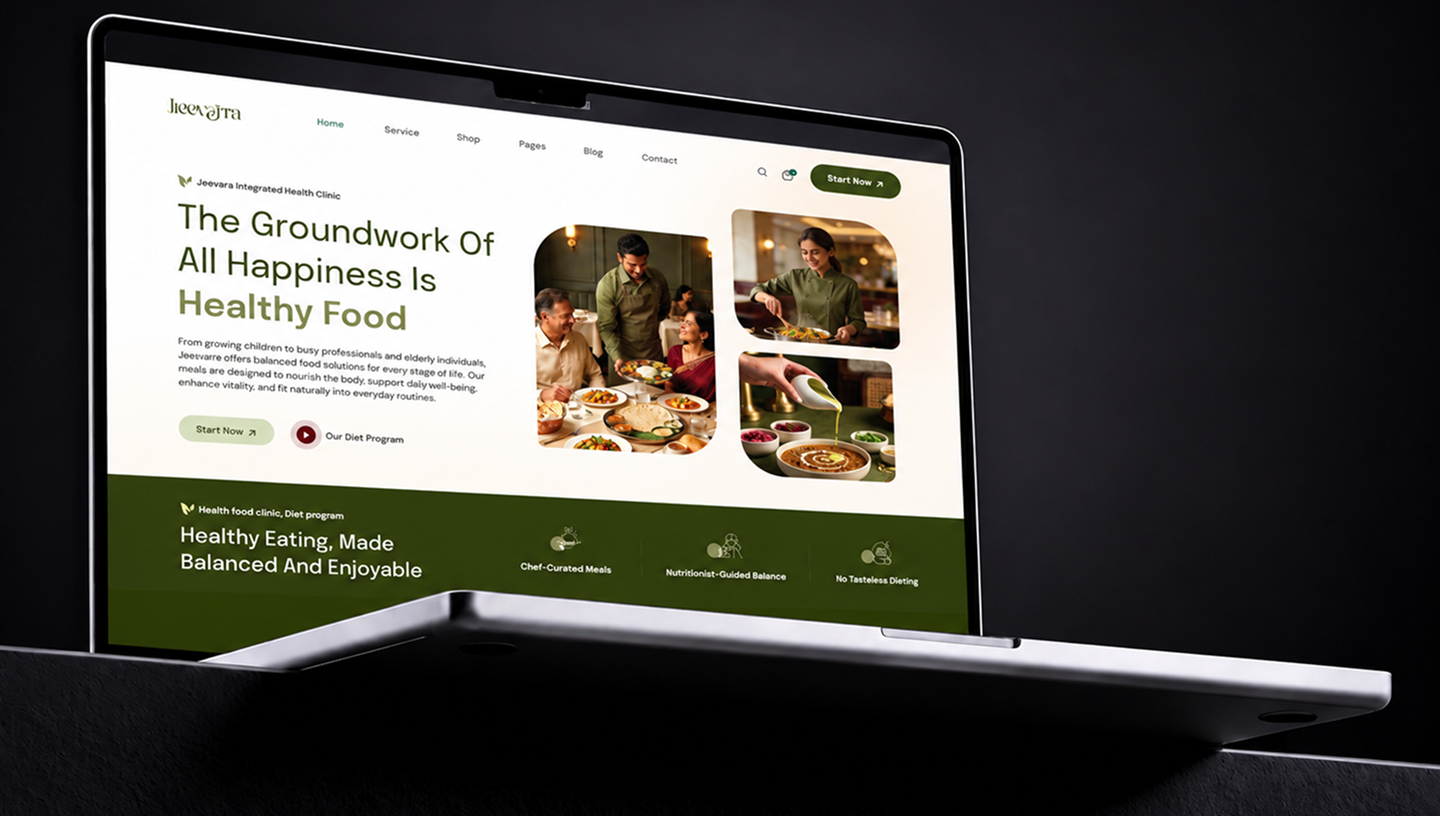
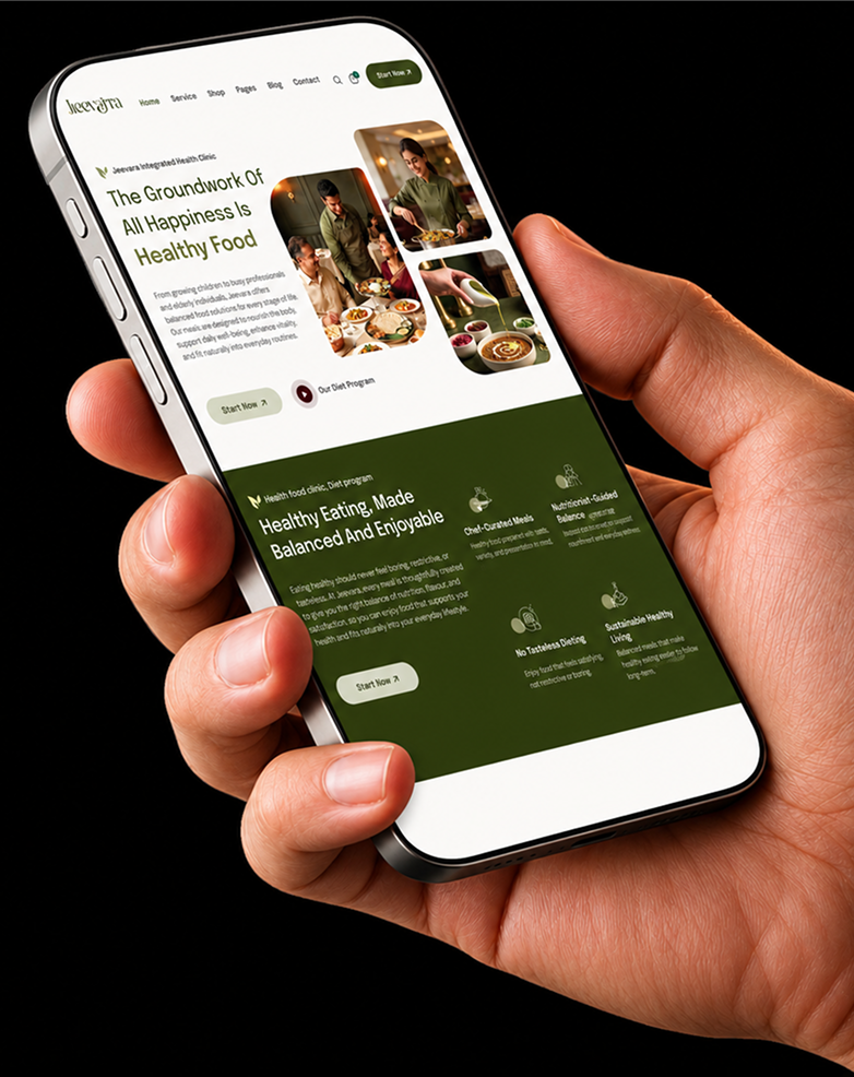
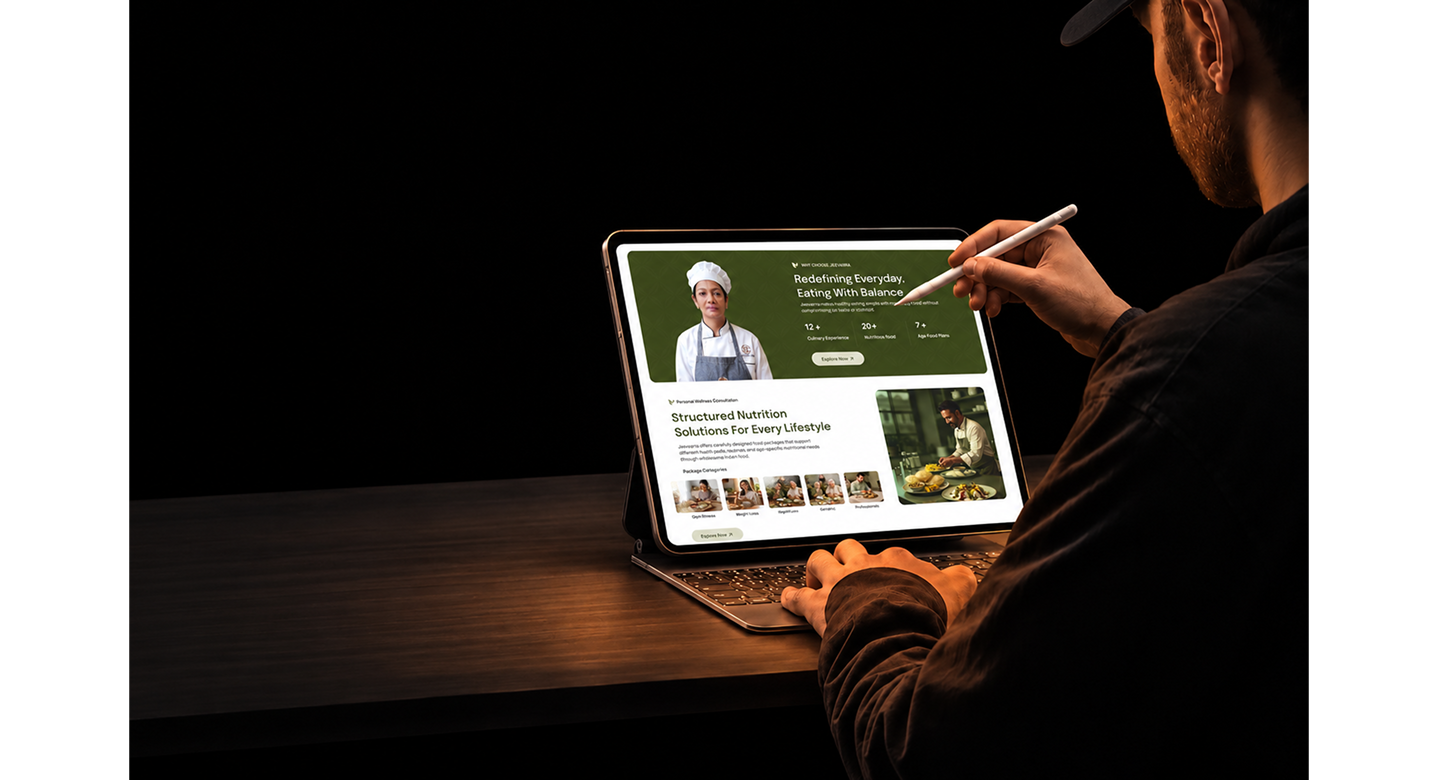
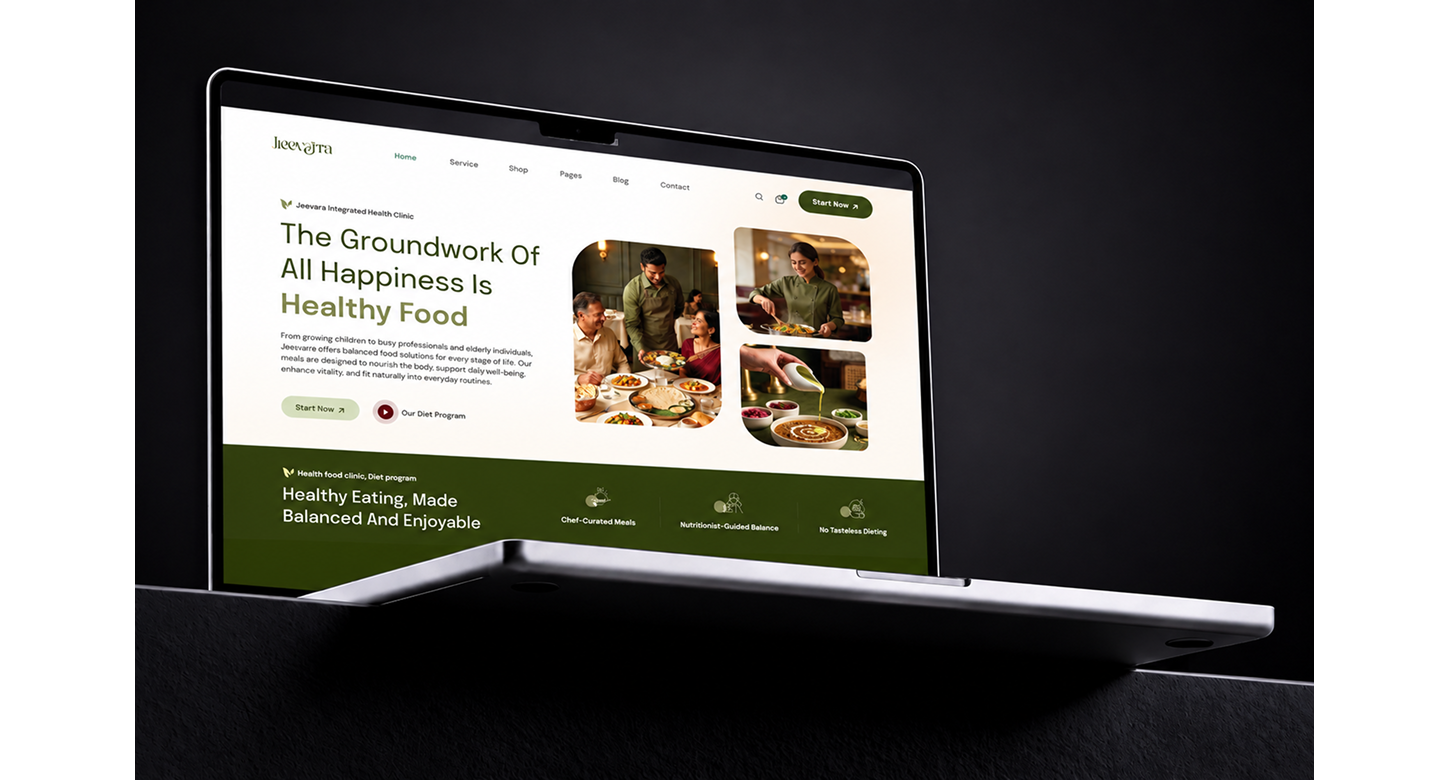
UI/UX Design & Development of Jieevarra Website
Ourea mapped the visitor journey from first discovery onwards, designed a clean interface around Jieevarra’s earthy greens and food imagery, and developed a fast, responsive site that is easy to navigate on any screen.