Olea
What is Olea
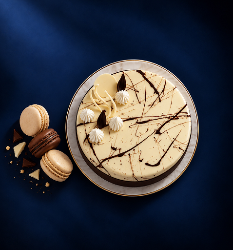
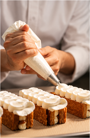
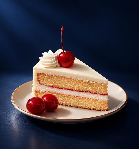
OLEA is a bakery and café serving premium bakes at fair prices: quality ingredients, thoughtful craftsmanship, and refined presentation in every layer. Special enough for an occasion, easy enough for every day

Olea Oven Baked Layers of Edible Artistry
The Problem client was facing
Bakery customers were stuck between two extremes: mass-produced counters with limited quality and high-end patisseries too precious for an everyday visit. OLEA was built for the space in between, but it needed a brand that looked premium without looking out of reach.
Premium felt out of reach. Affordable felt ordinary.
The Solution
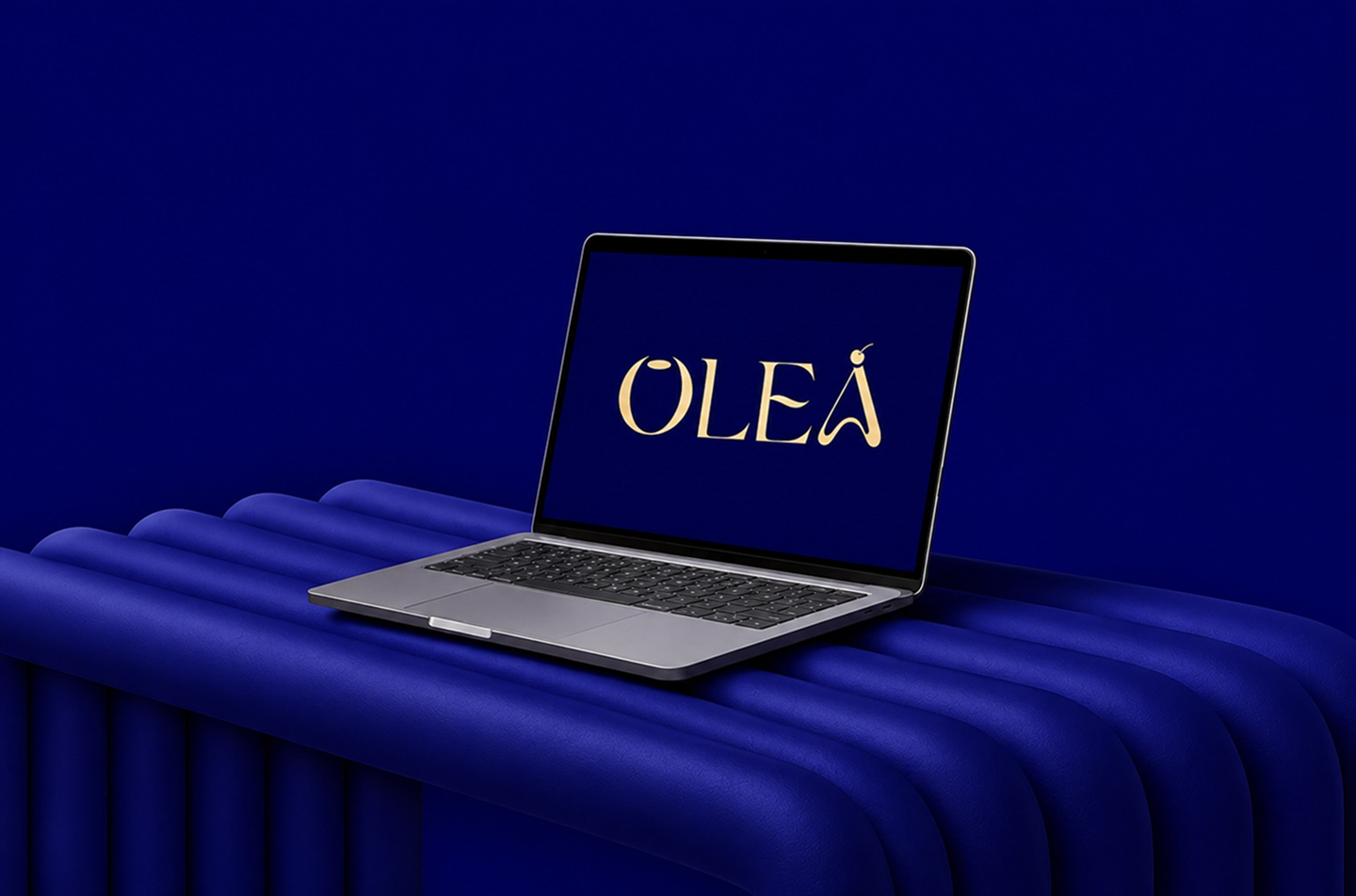
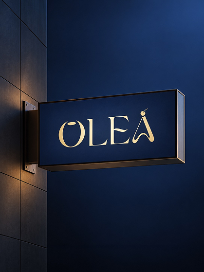
The Solution Ourea began with the name Oven-baked Layers of Edible Artistry. From it came a refined wordmark, a calm navy palette, and a warm voice that carries from the signboard to the menu to the box. The identity is premium yet approachable, letting the bakes take the spotlight and making every visit feel special, whether a daily indulgence or a meaningful moment.
Baked in layers. Made for every day.
Where it began
OLEA began with a simple belief: premium baking should feel inviting, not intimidating. The bakery had the craft and the ingredients. What it needed was a brand that could carry both, special enough for an occasion and easy enough for every day.

Discover
We studied the bakery market and found a gap between mass-made counters and high-end patisseries.
Define
We positioned OLEA in between: premium bakes at fair prices, refined yet approachable.
Design
We shaped the name, wordmark, and navy palette around Oven-baked Layers of Edible Artistry.
Develop & Deliver
We carried the identity across the signboard, menu, and packaging, so every visit feels consistent.
A Visual Language of Layers
OLEA’s identity is drawn from its own name: Oven-baked Layers of Edible Artistry. Every element is calm, refined, and warm, built to make premium baking feel inviting.
Artistry in every layer, Warmth in every visit
By combining quality ingredients, thoughtful craftsmanship, and refined presentation, OLEA turns everyday baking into moments of quiet indulgence. The concept highlights how creativity meets simplicity: a brand that speaks with warmth, care, and quiet confidence, elegant and polished yet never distant or overly formal.
It’s not just about baking well; It’s about making premium feel welcome, every day, Making the Name “OLEA” - A Perfect Reflection of its Craft
Identity Pillars


The Letter O
Core Identity
The “O” represents completeness, warmth, and indulgence. Its full, rounded form reflects the comfort and satisfaction of well-made baked goods.
Visual Identity
Inspired by the soft geometry of pastries and macarons, the “O” feels gentle and inviting.


The Letters L & E
Core Identity
The “L” and “E” stand for structure, balance, and precision. They reflect the discipline, technique, and consistency behind OLEA’s baking process.
Visual Identity
Clean serif letterforms with controlled curves convey refinement and clarity. They ground the brand in modern elegance with a calm, composed presence.


The Letter A
Core Identity
The sculptural “A” symbolises artistry and the maker’s hand. It represents aspiration, creativity, and the intentional craft behind every OLEA creation.
Visual Identity
Its flowing form and upward stroke echo piping movements and hand-finished pastry details.
#1E2F51

#FAF9DA
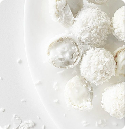
#FFFFFF
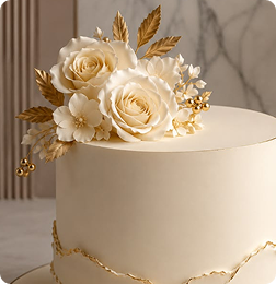
Gradient

Big Bang - Regular

Poppins - Light
Business Collateral & Merchandise
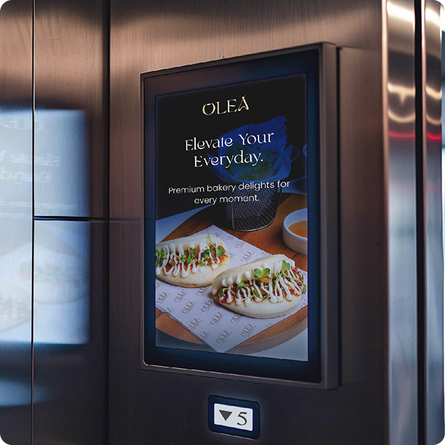
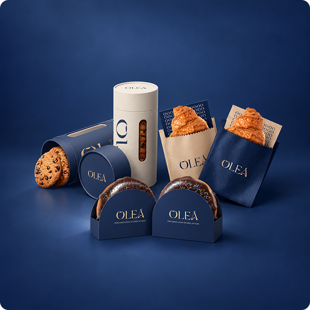
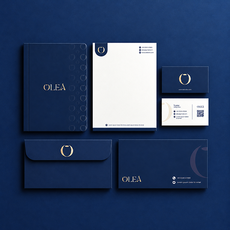
Every OLEA touchpoint wears deep navy and warm gold, a quiet signature that turns each piece into something crafted rather than simply produced.
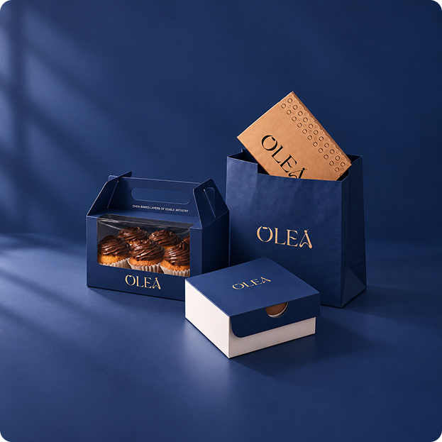
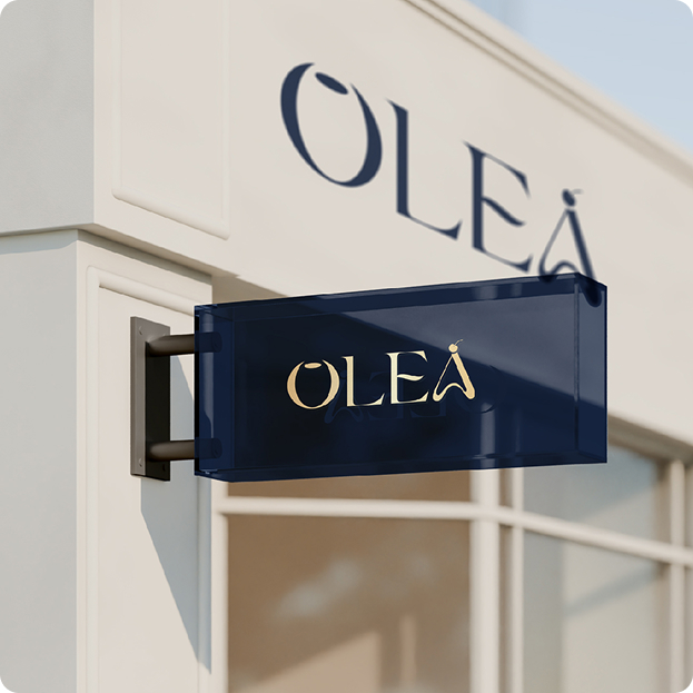
Marketing Collateral
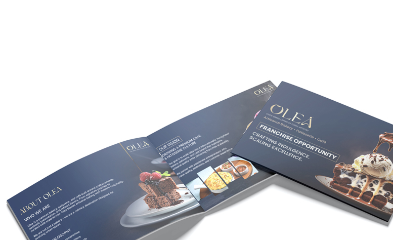
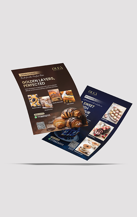
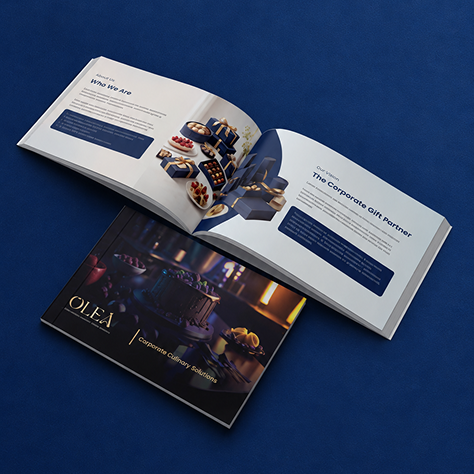
Across every piece of collateral, OLEA speaks in one composed voice: clear, elegant, and unmistakably its own, so the brand reads as polished on paper as it tastes in person.
Final Design
The final designs bring OLEA’s identity together across print: deep navy, warm gold, and generous space that lets the bakes take centre stage. Every layout is composed with the same restraint, so each piece feels refined, easy to read, and clearly part of one brand.
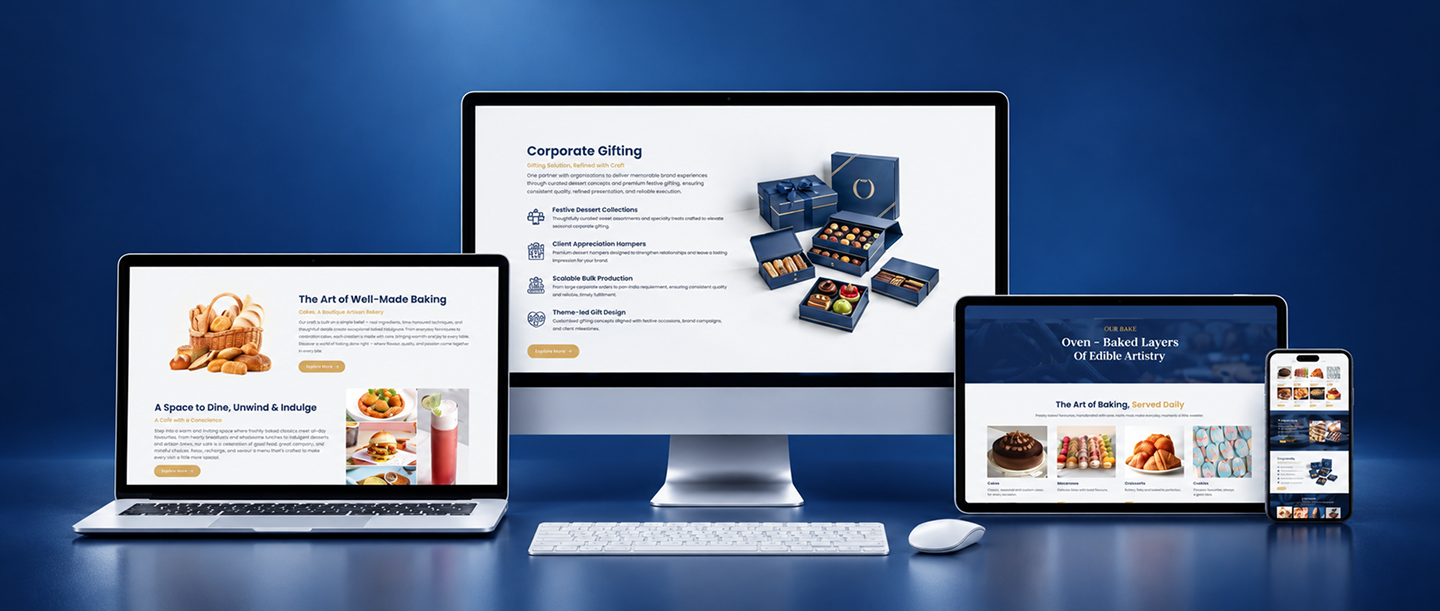
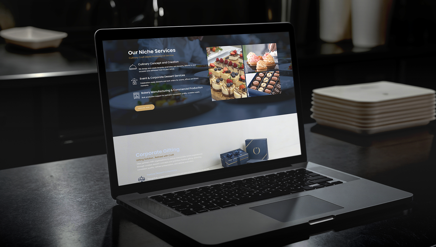
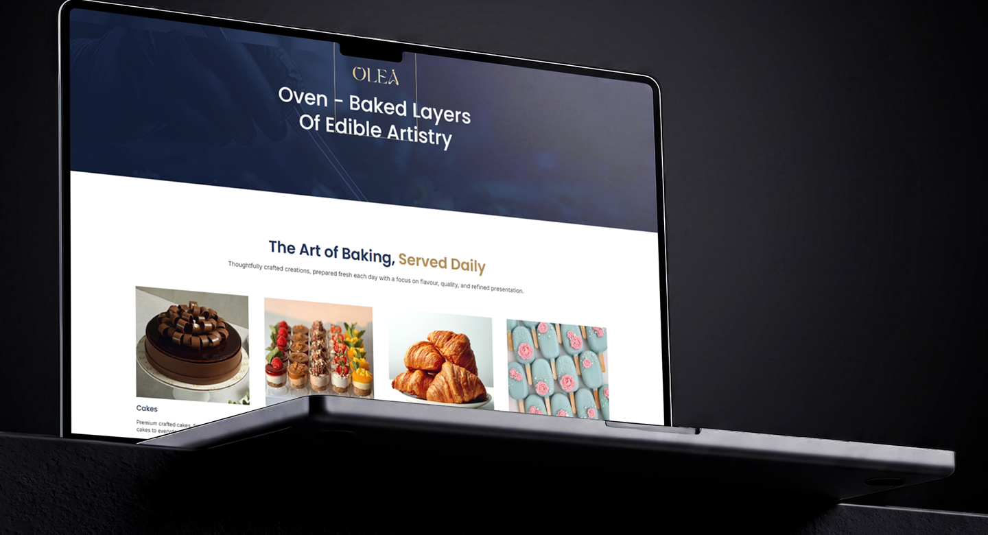
UI/UX Design & Development of Olea Website
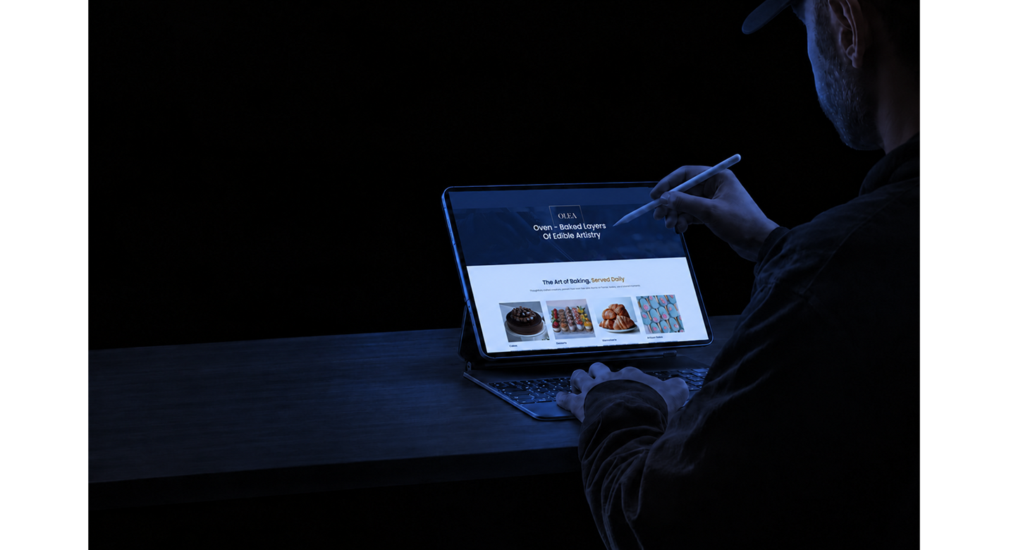
The website was designed to capture the artistry of OLEA’s bakes as visitors scroll, bringing together video and imagery in a calm, seamless flow that feels as warm and inviting as the café itself.