Plated
What is Plated
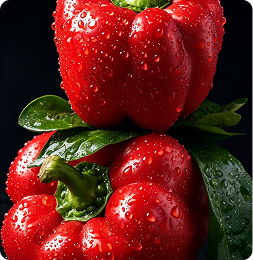
Plated serves boldly flavored, oil-free chicken, seasoned with the world’s best: fresh herbs, fiery chillies, and rich Italian cream sauces. Indulgent, premium, and far lighter than fried chicken has any right to be.

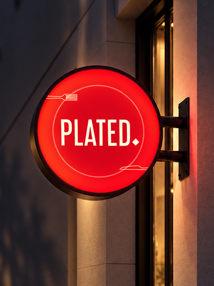
Plated As The Name That Owns It.
The Problem client was facing
Plated was the region’s first infused chicken outlet, and its food kept customers coming back. But its name, The menu and social pages had grown up separately , so from the street it looked like any other restaurant.
Regulars knew the difference. Newcomers had no reason to find out.
The Solution
Ourea began with the plate, where the kitchen’s work was finally seen. From it came a single mark, a palette of deep red and cream, and a consistent voice that carries from the signboard to the menu to the takeaway box. The identity is quiet on purpose, letting the Infused chicken takes the spotlight, allowing Plated to stand confidently as the original is.
Born from the plate. Made to be remembered.
Where it Began
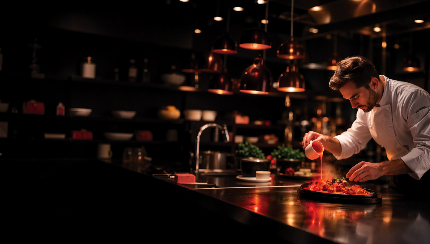
Plated was the region’s first infused chicken outlet, serving oil-free chicken packed with global flavours, from fresh herbs and fiery chillies to rich Italian cream sauces. The food built a loyal following, but the brand hadn’t caught up. As a first mover evolving from a casual eatery to fine dining, Plated needed a distinct positioning that gave food lovers a reason to walk in.
Discover
We studied Plated’s menu, loyal customers & competitors to understand Why was great food not drawing new diners?
Define
We positioned Plated as the region’s pioneer of infused chicken, a fine-dining experience built on bold global flavours.
Design
We created a logo where the plate represents both the dish & a global ambition, with a bold red & cream palette.
Develop & Deliver
We built brand guidelines & unified the menu, signage, and social pages under one distinct, premium identity.
A Visual Language of Taste
Plated’s identity makes flavor visible. Bold red captures the heat of global spices, warm cream reflects its rich sauces, and the plate in the logo stands for both the dish and a global ambition.
Plated means Chicken Served with Intent.
Blending bold flavours and global inspiration, from zesty herbs and fiery chillies to creamy Italian sauces, Plated turns simple chicken into a symphony of taste. Every dish is carefully crafted to celebrate creativity and flavor, making each meal an unforgettable experience.
It’s not just about serving food; it’s about presenting innovation and elegance on a plate, Making the Name "Plated" - A Perfect Reflection of its Vision
Identity Pillars
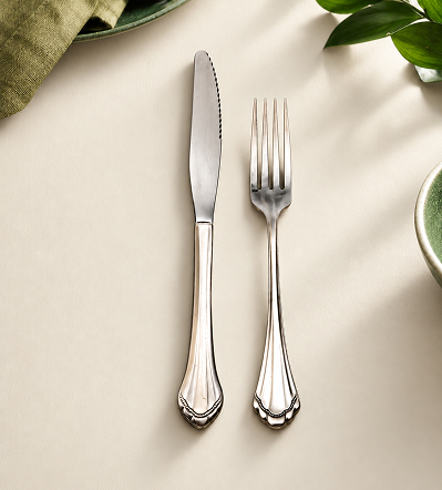


Knife & Fork
Core Identity
The fork and knife carry the brand’s mission to redefine. they stand for elegance , precision and the care taken over each dish before it reaches the guest
Visual Identity
The fork and knife in Plated’s logo represent its mission to redefine dining, symbolising a journey of taste and artistry.
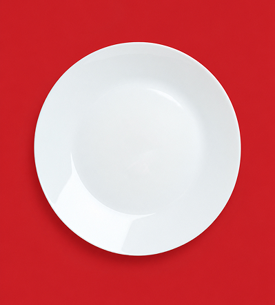


Plate
Core Identity
Plated brings global flavours to the local table, turning every meal into a crafted, intentional dining experience.
Visual Identity
The circular plate in Plated’s logo captures the essence of dining while representing the globe, a symbol of the world’s flavours served on one plate.
#D3202B
#FAF9DA

#FFFFFF
#000000

Libel - Regular

Storytelling _Regular

Robot - Regular
Business Collateral & Merchandise
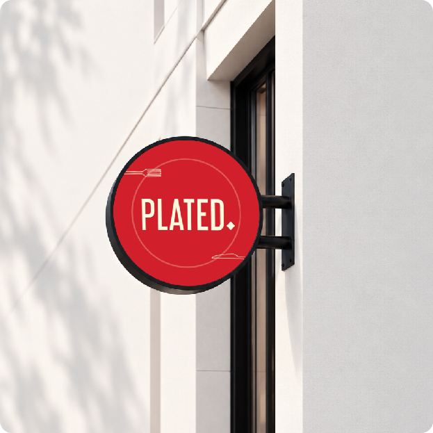
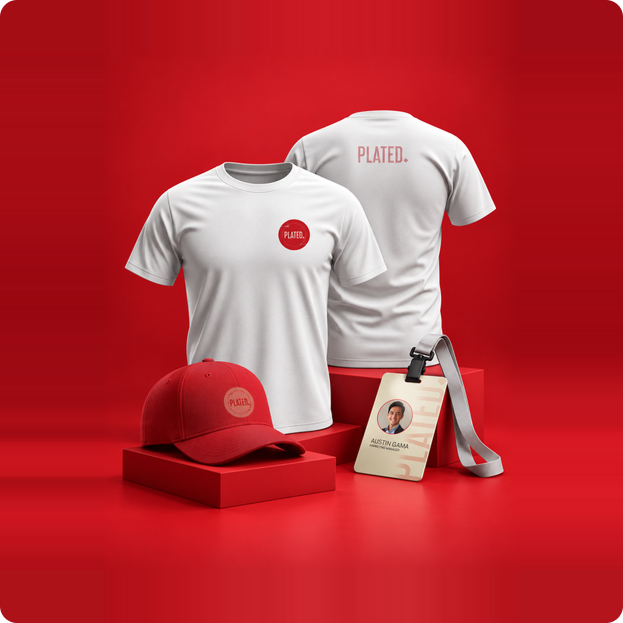
From menus to packaging, signage to staff uniforms, Plated speaks in one bold, confident voice, rooted in flavour and serving it with intention.
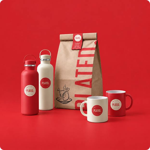
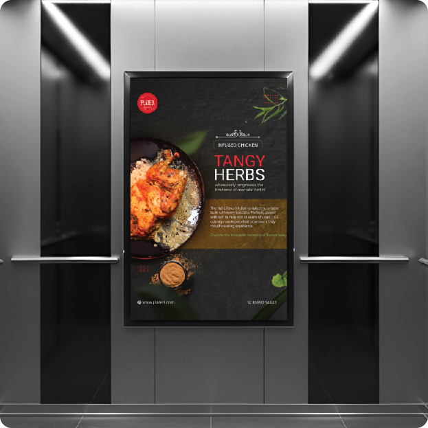
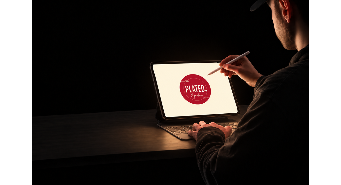
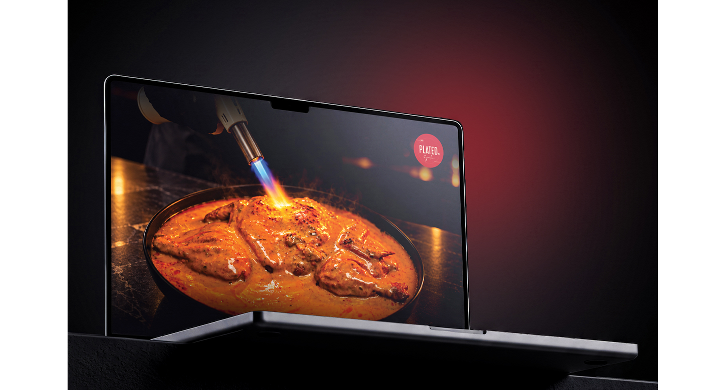
Marketing Collateral
Collateral that tells the Plated story, from its start as the region’s first infused chicken outlet to a fine-dining destination, through bold food imagery, warm red and cream tones, and clear, appetizing messaging.
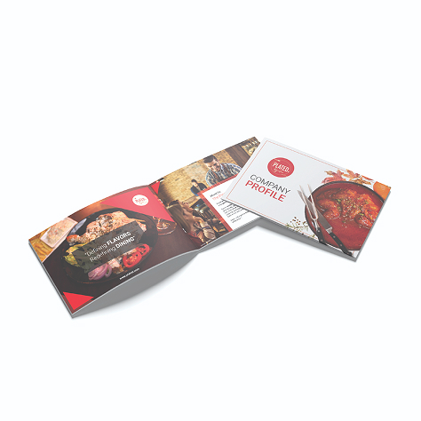
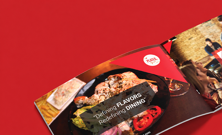
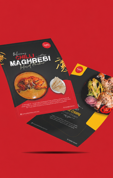
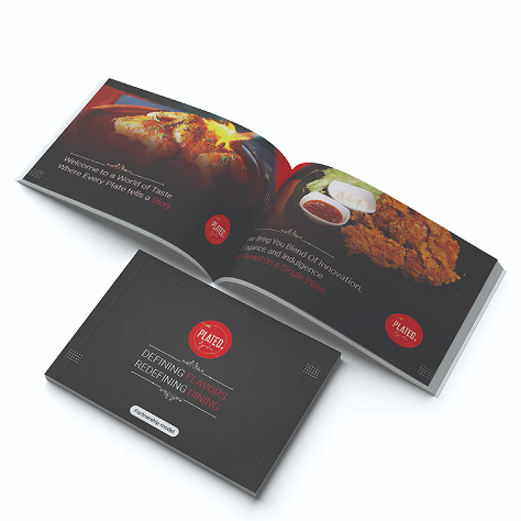
Final Design
Ourea gave Plated a unified identity, with a plate-and-globe logo, bold red and cream palette, and the tagline “Redefine Flavours, Redefine Dining.” Applied across menus, signage, and social pages, it makes the brand look as crafted as its food.
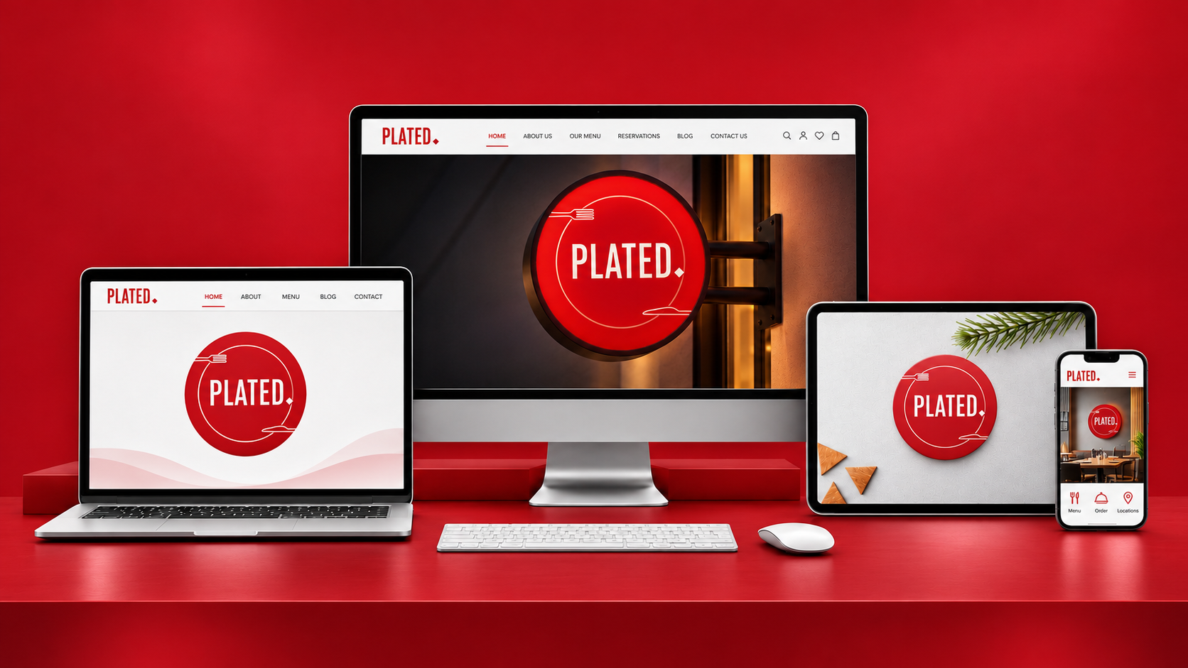
UI/UX Design & Development of Plated Website
Ourea designed and built a website that brings Plated’s bold identity online, with appetizing food imagery, an easy-to-browse menu, and a seamless path from discovery to dining.