
Packaging That Sells From the Shelf
Packaging is often the first conversation a brand has with its customer. See how we gave Nutriti's packaging clarity, relevance, and shelf appeal.
Team Ourea

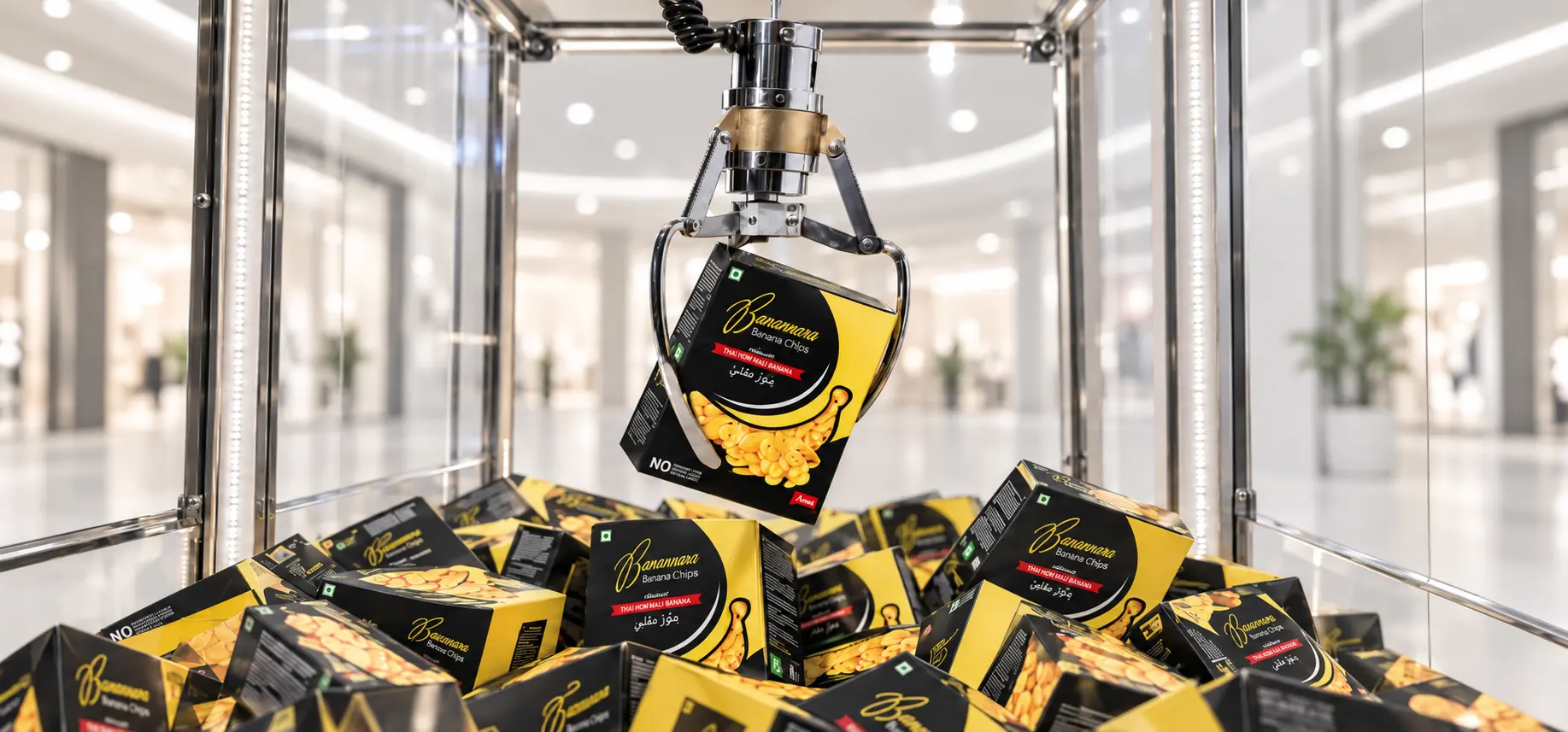

In a supermarket aisle, a shopper spends only a few seconds deciding what to pick up. No one explains the product, describes the taste, or points out what makes it better. The packaging has to do all of that on its own. At Ourea, we design packaging that grabs attention, communicates quickly, and gives shoppers a clear reason to choose it.
What Is Nutriti?
Nutriti is a packaged food brand that brings authentic flavours to everyday kitchens. Its range spans snacks, savoury treats, spice blends and dried seafood, from crisp banana chips fried in pure coconut oil to ready-to-use masalas and traditionally dried fish. Every product is made with quality ingredients and a focus on purity, so customers can enjoy familiar tastes with confidence.
The Challenge: Many Products, One Brand
Nutriti's range covers very different categories, and each one sits in a different part of the store: snacks in one aisle, spices in another, seafood in a third. Every product had to compete with its own set of rivals, yet the whole range still needed to feel like one trusted brand. The packaging had to be distinctive enough to win each shelf and consistent enough to build recognition across all of them.
A Fresh Foundation: The Nutriti Identity
We began with the brand itself. The Nutriti mark is a clean, modern leaf, a simple symbol of freshness, nature and nourishment. It is paired with a calm palette of deep and leafy greens that reflects natural ingredients and honest food. The identity extends across brochures, stationery, signage and merchandise, giving Nutriti a polished, professional presence well beyond the shelf.
Clarity: Showing What's Inside
On every pack, we set a clear hierarchy: the brand, then the product name, then the key promise. Wherever we could, we let the product speak for itself. A transparent window on the Dry Croaker pouch shows the quality of the fish, a banana-shaped window on Baenana is filled with golden chips, and a rich, appetizing dish on the Chicken Masala pack shows customers exactly what they can cook. Shoppers understand each product within seconds.
Relevance: Speaking the Customer's Language
Nutriti serves customers across Kerala and the Gulf, so we designed the packaging to speak to both. Product names appear in English alongside Malayalam and Arabic, making every pack feel familiar wherever it is sold. We also put the details buyers care about front and centre, such as "Fried in Pure Coconut Oil," "No Preservatives, No Flavours" and a clear promise of purity and quality.
Shelf Appeal: A Distinct Look for Every Category
Rather than forcing one look onto every product, we gave each category its own colour story while keeping the Nutriti leaf as the common thread. The Chicken Masala pack uses warm reds that suggest spice and flavour. The dry seafood range uses cool ocean blues with a crisp navy band that instantly signals the sea. Baenana pairs deep black with rich banana yellow for a bold, premium snack look. Elegant script lettering for product names adds a handcrafted touch across the range. Each pack stands out in its own aisle, and together they are recognisably Nutriti.
Why Packaging Matters
For packaged food brands, the pack is the most visible advertisement a brand will ever have, and often the deciding factor at the point of purchase. Clear, relevant and distinctive packaging earns attention, builds trust and turns first-time buyers into regular customers. For Nutriti, it means a growing range of products that sell from the shelf, each with its own personality and all under one trusted name.