
What Your Colour Palette Says Before You Do
Colour shapes perception in seconds. Here's how we built a palette for Scented Cascade that feels as distinct as the brand itself.
Team Ourea

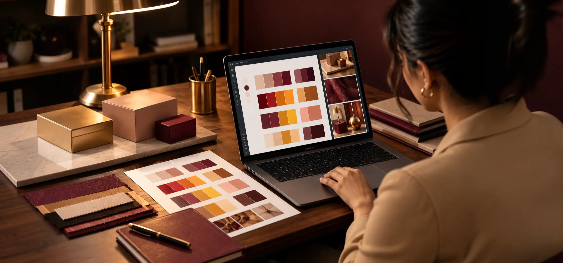

Before a customer reads your name, smells your product, or hears your story, they have already seen your colours. In those first few seconds, colour tells people whether a brand feels premium or playful, calm or energetic, trustworthy or forgettable. At Ourea, we treat colour as a brand's first sentence, so we make sure it says the right thing.
What Is Scented Cascade?
Scented Cascade is a sensory lifestyle brand that brings fragrance, ambience, and emotional comfort into everyday spaces. It is built on the belief that scent, atmosphere, and aesthetics shape how we feel. The brand creates thoughtfully crafted aromatic products for homes, workplaces, hospitality, gifting, and personal spaces. Made with pure essential oils, vegan and sustainable ingredients, and soy wax candles, every product is designed to go beyond fragrance and turn ordinary surroundings into calm, personal sanctuaries that inspire wellness, rejuvenation, and mindful living.
The Challenge: Making a Feeling Visible
Fragrance is invisible, so the brand's visuals had to carry what the products make people feel. The home fragrance market is crowded with soft pastels and minimal whites that look calm but rarely look different. We needed a palette that captured comfort and mindfulness while giving Scented Cascade a presence that people would remember long after they left the shelf.
How We Built the Palette
We began with the emotions the brand promises: calm, warmth, indulgence, and care. Rather than following the category's pale tones, we chose a deep wine shade as the foundation, a colour that feels rich, intimate, and quietly luxurious, like the glow of a candle in a dim room. We paired it with soft gold accents that suggest warmth, craftsmanship, and the premium quality of natural ingredients. Together, the two colours create a sense of depth and sanctuary, so the brand feels more like an experience.
Bringing the Palette to Life
We carried the palette consistently across every touchpoint, from signage and packaging to gifting and digital spaces. The deep wine background lets the gold emblem stand out with elegance, while the restrained use of colour keeps the identity calm and uncluttered. Whether Scented Cascade appears in a home, a hotel lobby, or a gift box, it is instantly recognisable and always feels the same: warm, refined, and soothing.
Why Colour Matters for Your Brand
Colour is often the first thing people remember and the last thing brands think about. The right palette sets expectations, builds recognition, and separates a brand from everyone else in its category. The wrong one can make even an exceptional product feel ordinary.
For Scented Cascade, colour became a way to make a feeling visible, so the brand speaks before a single word is read.